
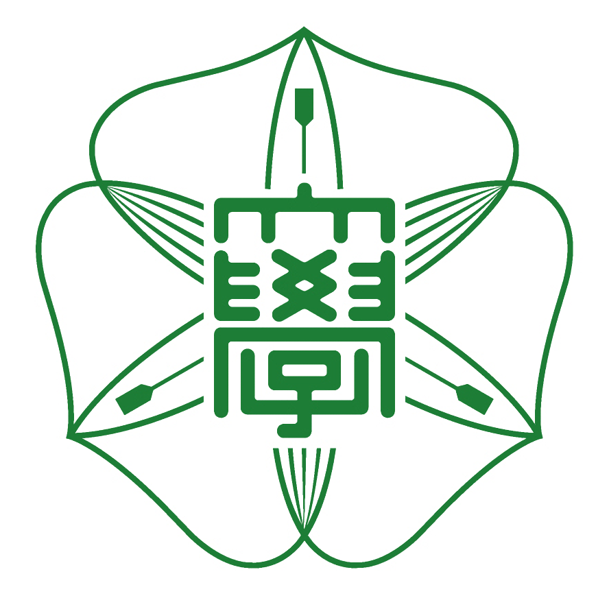
The Hokkaido University logo is a stylized design of a trillium (liliaceae/lily family), which grows on campus. The design of this perennial was selected in a contest in 1950. On the university’s 120th anniversary in 1996, the design was altered to its present form and was formally made the university’s symbol.
The petals and sepal which make up the six directions (East, West, South, North, Heaven, and Earth) symbolize the dissemination of information from Hokkaido University to Japan and to the world. The characters in the middle are old forms of the Chinese characters for “dai-gaku,” or “university.”